
XDDD I felt the urge to post a tutorial made kwa me on this spot XDDDD (way to boast :P). WARNING, there are a lot of settings to put on. so wewe could die of boredom!!BTW, for this tut wewe might have at least some knowledges on how to use PS, otherwise it would look terribly hard :) .
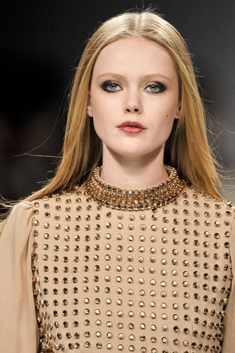
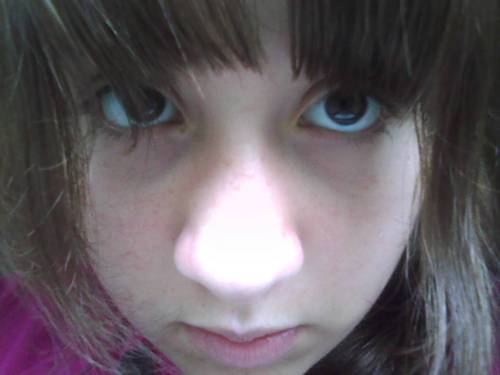
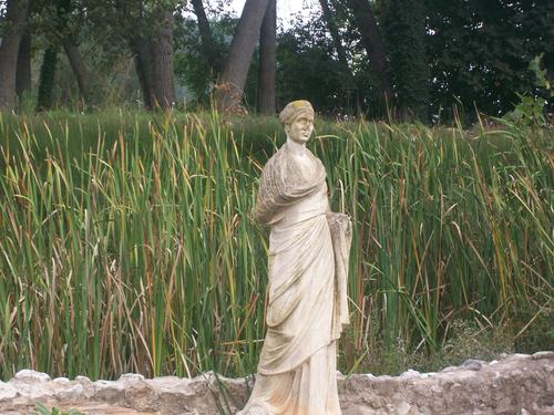
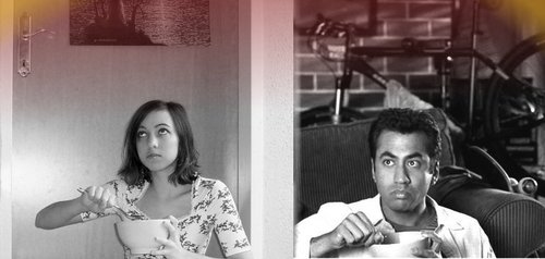
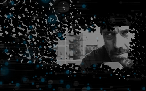
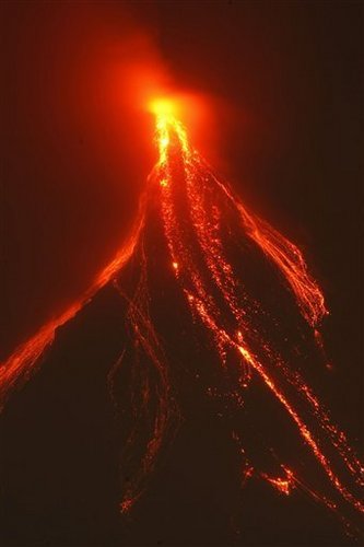
We'll be making this  from this.
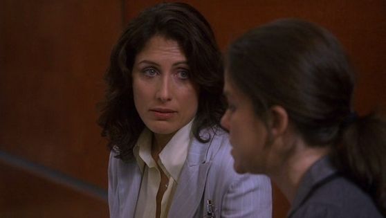
Ok
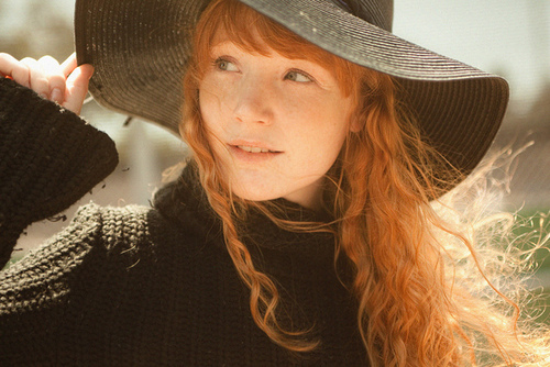
1st: crop your base.This isnt an essential thing to do:you can either crop it in the start au in the end, its your own choice.But for this, I decided to crop it now.
I decided to make it clearer. So I went to Filter >Noise > Reduse Noise and set these settings:
STRENGHT: 10
PRESERVE DETAILS:12
REDUCE COLOR NOISE:25
SHARPEN DETAILS:27
It looks good, but now I cant really see the edges as clear as I want them to be.So I go to Filter >Sharpen >Unsharp Mask and set:
AMOUNT: 42
RADIUS: 9,9
THRESHOLD: 0
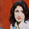
AAAH, Now I t looks as I wanted it to be!
We're gonna make a (lovely) Curves layer with these settings:
RGB:1st point...Output 140-Input 48
2nd point...Output 197-Input 146
RED:1st point...Output 85-Input 99
2nd point...Output 122-Input 145
GREEN:1st point...Output 121-Input 105
2nd point...Output 153-Input 129
BLUE:1st point...Output 129-Input 115
2nd point...Output 159-Input 156
Dude, that was a hard work! Well, it was worth it: now our image looks brighter and a bit washed out.But now we want to add a bit of color and light.So we open a Channel Mixer layer and put these settings:
(output channel)RED:
+111
-16
+7
(output channel)GREEN:
+5
+96
0
(output channel)BLUE:
+2
-12
+113
TADAAAA! Doesnt it look a bit better now? But Im not satisfied yet (Im complicated, I know ;]).
So, for wewe own happiness, we open another Curves layer *waits for people to throw vegetables at her*
Here the settings:
RGB:1st point... Output 84-Input 106
2nd point...Output 139-Input 146
RED:1st point...Output 140-Input 142
2nd point...Output 122-Input 129
GREEN:1st point...Output 107-Input 114
2nd point...Output 154-Input 158
BLUE:1st point...Output 142-Input 129
2nd point...Output 131-Input 89
AND WE'RE DONE!! XDDD But only with the Curves layer MUHAUHAUHA!!!With this layer, I made the image look darker in all the right places, and now , the red on the ukuta looks better than before.
Time for a Colo Balance layer!!
Midtones :+5 | -5 | -12
Shadows :0 | +2 | -6
Highlights: -10 | -13 | +12
Make sure the "Preserve Luminosity" little box is checked :)Also, set it at Color Dodge, opacity 17%
Brighter, uh?
I dunno why, but now I want it to look "warmer" so I add a "Sepia" picha Filter. It looks like she got a bit of color on her (pretty, pretyy, PRETTY) face :) The pic looks nicer, but I still see it as if it is uncompleted and boring. So what to do?A Selective Colors layer, of course!
REDS: -100 | -18 | +100 | 0
YELLOWS: + 98 | -6 | -100 | 0
GREENS: +28 | -21 | -12 | 0
CYANS: +26 | +20 | -17 | +15
BLUES: +36 | -25 | -17 | 0
NEUTRALS: +17 | -10 | -17 | 0
Set this layer to Color Burn, opacity 30%
It darkens the picture a bit.
Now dublicate your base, bring it on the juu all your layers and set it to Soft Light 20%
Again, we made our picture darker, but in all the right places .:):)
Another Selective Colors layer!
REDS: -100 | +20 | +30 | 0
YELLOWS : -15 | 0 | +15 | 0
WHITES : -5 | +20 | +15 | 0
NEUTRALS : +20 | +10 | +15 | -25
It looks brighter, and the reds look stronger. Be sure to set the opacity of the layer to 65% !
Before we're done, we need to make one last layer ! (I know, Im evil MUHAUHUHA)
So make a new Color Balance layer :
Midtones : -20 | +15 | -20
Shadows : -95 | -15 | +55
Highlights : -5 | -10 | 0
Again, check if the "Preserve Luminosity" little box is checked.Set this layer to Soft Light 30% (add text , textures and brushes if wewe want )and...
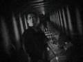
TADAAAAAAA!! We're done!!! This my tutorial, but on these bases, wewe can create your own! Its funny to see the outcome of what wewe try to make!! xD
Please, maoni and let me see what wewe got from this tut! (This should work on every pic , cause I tried it on other picha ;])
Sorry for any spelling mistake, but Im too tired and too lazy to re-read it :D
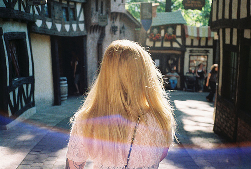
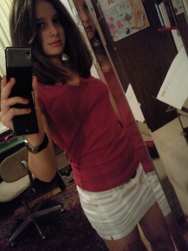
We'll be making this

Ok
1st: crop your base.This isnt an essential thing to do:you can either crop it in the start au in the end, its your own choice.But for this, I decided to crop it now.
I decided to make it clearer. So I went to Filter >Noise > Reduse Noise and set these settings:
STRENGHT: 10
PRESERVE DETAILS:12
REDUCE COLOR NOISE:25
SHARPEN DETAILS:27
It looks good, but now I cant really see the edges as clear as I want them to be.So I go to Filter >Sharpen >Unsharp Mask and set:
AMOUNT: 42
RADIUS: 9,9
THRESHOLD: 0
AAAH, Now I t looks as I wanted it to be!
We're gonna make a (lovely) Curves layer with these settings:
RGB:1st point...Output 140-Input 48
2nd point...Output 197-Input 146
RED:1st point...Output 85-Input 99
2nd point...Output 122-Input 145
GREEN:1st point...Output 121-Input 105
2nd point...Output 153-Input 129
BLUE:1st point...Output 129-Input 115
2nd point...Output 159-Input 156
Dude, that was a hard work! Well, it was worth it: now our image looks brighter and a bit washed out.But now we want to add a bit of color and light.So we open a Channel Mixer layer and put these settings:
(output channel)RED:
+111
-16
+7
(output channel)GREEN:
+5
+96
0
(output channel)BLUE:
+2
-12
+113
TADAAAA! Doesnt it look a bit better now? But Im not satisfied yet (Im complicated, I know ;]).
So, for wewe own happiness, we open another Curves layer *waits for people to throw vegetables at her*
Here the settings:
RGB:1st point... Output 84-Input 106
2nd point...Output 139-Input 146
RED:1st point...Output 140-Input 142
2nd point...Output 122-Input 129
GREEN:1st point...Output 107-Input 114
2nd point...Output 154-Input 158
BLUE:1st point...Output 142-Input 129
2nd point...Output 131-Input 89
AND WE'RE DONE!! XDDD But only with the Curves layer MUHAUHAUHA!!!With this layer, I made the image look darker in all the right places, and now , the red on the ukuta looks better than before.
Time for a Colo Balance layer!!
Midtones :+5 | -5 | -12
Shadows :0 | +2 | -6
Highlights: -10 | -13 | +12
Make sure the "Preserve Luminosity" little box is checked :)Also, set it at Color Dodge, opacity 17%
Brighter, uh?
I dunno why, but now I want it to look "warmer" so I add a "Sepia" picha Filter. It looks like she got a bit of color on her (pretty, pretyy, PRETTY) face :) The pic looks nicer, but I still see it as if it is uncompleted and boring. So what to do?A Selective Colors layer, of course!
REDS: -100 | -18 | +100 | 0
YELLOWS: + 98 | -6 | -100 | 0
GREENS: +28 | -21 | -12 | 0
CYANS: +26 | +20 | -17 | +15
BLUES: +36 | -25 | -17 | 0
NEUTRALS: +17 | -10 | -17 | 0
Set this layer to Color Burn, opacity 30%
It darkens the picture a bit.
Now dublicate your base, bring it on the juu all your layers and set it to Soft Light 20%
Again, we made our picture darker, but in all the right places .:):)
Another Selective Colors layer!
REDS: -100 | +20 | +30 | 0
YELLOWS : -15 | 0 | +15 | 0
WHITES : -5 | +20 | +15 | 0
NEUTRALS : +20 | +10 | +15 | -25
It looks brighter, and the reds look stronger. Be sure to set the opacity of the layer to 65% !
Before we're done, we need to make one last layer ! (I know, Im evil MUHAUHUHA)
So make a new Color Balance layer :
Midtones : -20 | +15 | -20
Shadows : -95 | -15 | +55
Highlights : -5 | -10 | 0
Again, check if the "Preserve Luminosity" little box is checked.Set this layer to Soft Light 30% (add text , textures and brushes if wewe want )and...
TADAAAAAAA!! We're done!!! This my tutorial, but on these bases, wewe can create your own! Its funny to see the outcome of what wewe try to make!! xD
Please, maoni and let me see what wewe got from this tut! (This should work on every pic , cause I tried it on other picha ;])
Sorry for any spelling mistake, but Im too tired and too lazy to re-read it :D